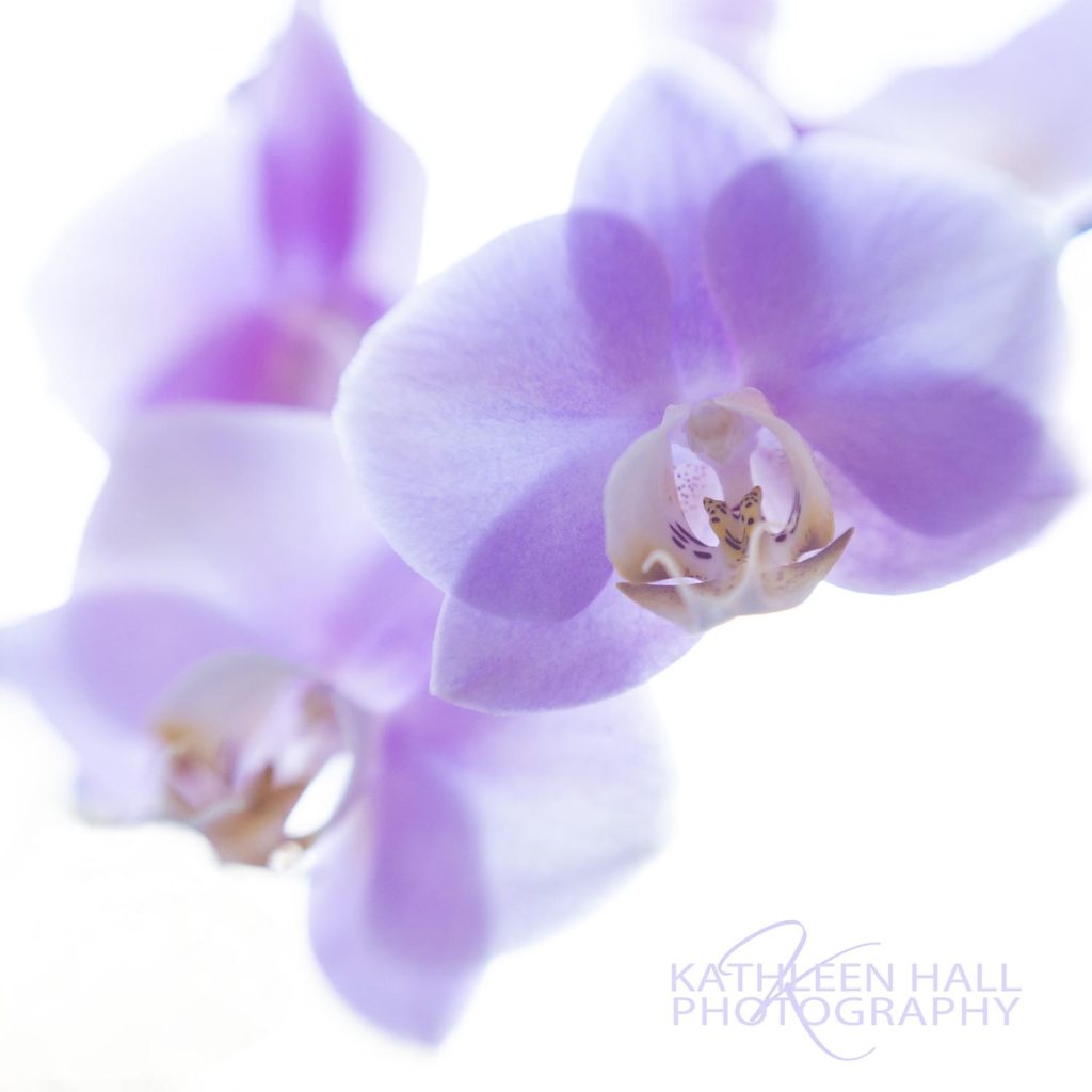
But my sister, who is a florist, has more than a dozen in her home and they bloom like crazy! I took some time to photograph them indoors and stay out of the heat as well. I love photographing flowers (Fine Art by Kathleen ) and have shown my work in many different art shows around the country.
Orchids in Light
The first example is SOOC (straight out of camera) with only a few minor tweaks to color and contrast. And cropped in the square format.
I back lit the blossoms against the bright kitchen window and intentionally over exposed it. Letting the background go white and keeping the focus tight on the blossoms.
Try this at home!
It works best with a delicate bloom with not too many petals in the flower. Tulips and orchids are great subjects. Roses, not so much. They are too dense to give the delicate look this technique works best on.
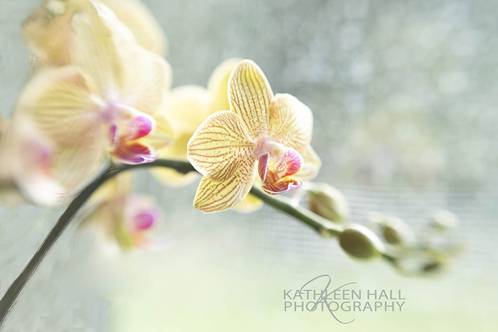
Study in Yellow
In this second image I used a similar technique .
This one I did not shoot directly into the back light, but more at an angle. You can see the outdoors in the background, through a screen if you look closely. The dappled background comes from using a very shallow depth of field, again focusing tight on the main bloom to get sharp focus. In this image, I did NOT overexpose it to give that ethereal light and delicate look in the first image.
A shallow depth of field, 1.4 or 2.8 usually will give this type of look. This image I cropped to give a stronger feel using the rule of thirds:
Using a tic-tac-toe type of imaginary grid, crop so that the main points of interest fall where the grid intersects.
Also put the main horizontal lines or the main vertical lines on one of the grid lines. This usually gives the strongest composition.
Use a shallow depth of field:
Either put your camera on M (manual) and dial in the exposure or, if you are too nervous to do that, just set the camera on A (aperture), choose the smallest aperture and let the camera pick the shutter speed. (The smallest aperture is the one with the lowest number, ie: 1.8, 2.0, 3.5, 4.5 or 5.6, depending on your lens. The numbers are on the lens itself. Just turn the ring until the lowest number lines up with the white dot on the lens.)
Sometimes the most gorgeous images are indoors! Experiment and let me see your results.
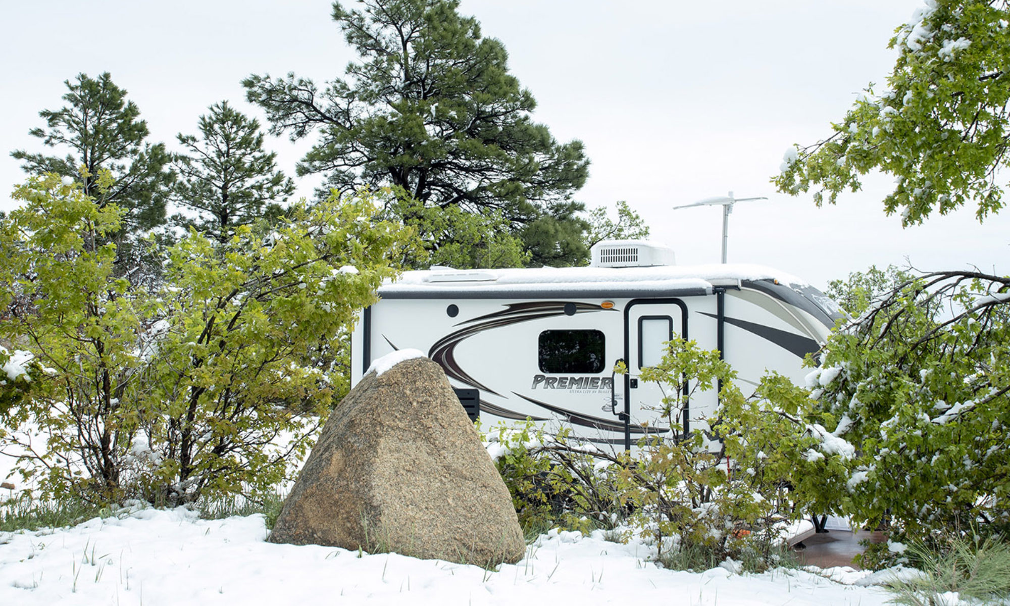
One of the REALLY nice benefits of traveling is being able to visit with family and friends more often.
Thanks for reading. I hope I expand your view of the world and give you a few tips for creating your own gorgeous images.
If you would like to see more of my travels and hints for creating better travel pictures, please subscribe to this blog below.
Questions? Feel free to comment and I will answer!
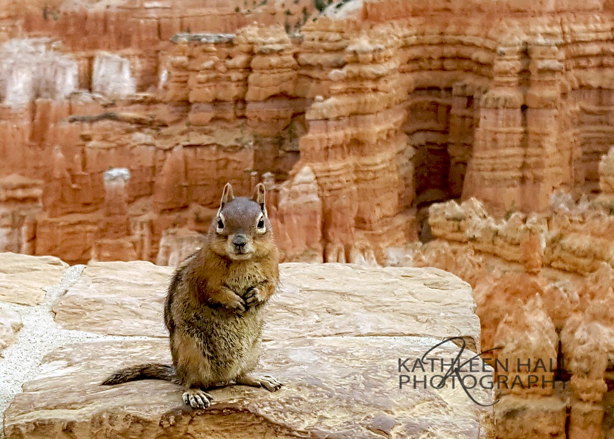
Being a portrait photographer for over 30 years makes me look at things a little differently.
I am used to directing my clients to help them achieve their best look by posing them. This little guy took direction quite well……
Head up, sit up straight, front foot to camera, weight on your back foot, relax your hands, smile with your eyes, ears up straight…oh wait, not the ear thing.
But this little chipmunk patiently posed in all the right ways to create a charming portrait in Bryce Canyon! I just love this shot!! He literally just sat there and gave me a half dozen different poses. I wished I had had a snack to reward him with (although there is no feeding of animals allowed in the park).
I would like to share with you my 4 simple photography hints to create beautiful travel photos. After creating thousands of photographs, these are my top time tested hints to share with you. They are fairly easy to remember, don’t involve any new camera equipment and there is only 4 for you to focus on at this time.
1. Use known objects or structures in your photographs to create relationships between them.
Placement of known objects, animals, people or structures within a photograph helps the viewer relate to what they are looking at. Remember that photography is two dimensional whereas life is 3 dimensional. Because the viewer does not have the ability to be there and experience the dimension of space or depth, it is helpful to give them a known object to use as a point of reference.
In the above photograph, the oddity of the chipmunk being so small within the greater context of the enormous Bryce Canyon, make you stop and look twice.
He illustrates a sense of place and dimension by combining a commonly known item (chipmunk) with a not so commonly known place (Bryce Canyon).
Besides the fact that he is cute as a button, this also works because he is color coordinated with the background
2. Use a dominating color technique when possible
Try using the dominating color technique next time you create an image. Be aware of the color in an area that you want to photograph and see if you can enhance it by cropping or framing the picture creatively to enhance the dominate color and its variations, allowing only one main color to stand out.
Dominate color is when one color is predominate in the photograph and represents one base color with varying shades, tints and tone.
Shades in a photograph show lighter and darker versions of the same hue. Technically, a shade is the color you get when you add black to any given hue. Various shades just refer to how much black you add.
Tint is the opposite of shade, in that it is technically the color you get when you add white to a particular color.
Tone is what you get when you add both black and white to a color and create a tone. Saturation and tone are close cousins in terms and are often used interchangeably. Tone is more often used when referring to painting and saturation is used when talking about digital images.
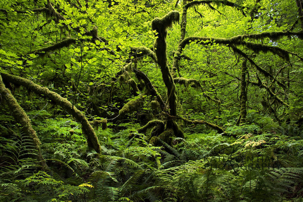
This photograph was taken on a small trail through the Federated Forest in Washington State on Mt Rainer near the White River.
It was a complete surprise when I found this trail ( I like to use the All Trails app) and really not too difficult to hike. Each bend provided a new view of this lush forest and I felt like I was in a real life episode of Lord of the Rings, expecting Frodo Baggins to pop out any minute!
Both of the above images show two different different single dominate color schemes.
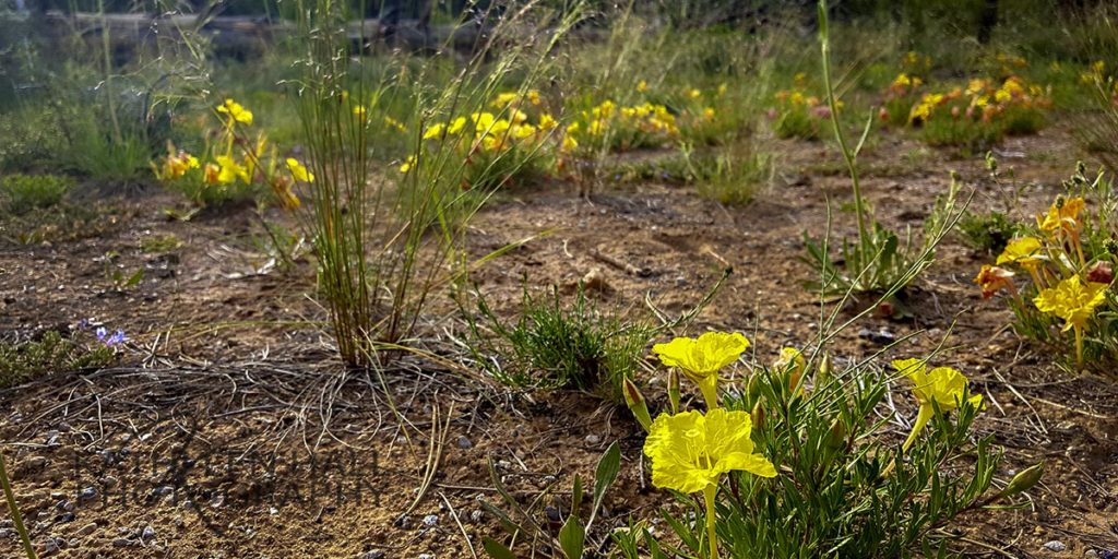
2. Look for the unusual to make great travel photos
Yellow evening primrose near Bryce Canyon
When I am in a place, I like to look for images that are out of the ordinary type of travel photos.
This image above is of the evening primroses that grow around the rim near Fairyland Canyon in Bryce Canyon. I loved the way they are backlit.
The softness of the grasses and flowers against the dead log in the background create a mix of textures. New flower growth and old logs side by side show differences that make a scene interesting.
This is definitely not the typical image taken in Bryce Canyon, in fact no part of the canyon is even hinted at!
But there is always more to a place than the obvious dominating landscape features. A smaller more intimate scene can bring back memories of the details surrounding a place.
Also, mixing textures adds greatly to the story that a photograph can tell. To get new and unusual images when you travel, look beyond the obvious, no matter how overwhelmed you are with the place!
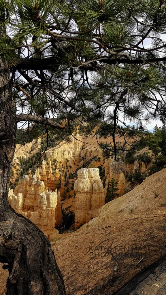
4.Use Framing to give a sense of size and intimacy.
Bryce Canyon
Framing is a great technique to learn and use when creating memorable travel photos. This image is framed by a Ponderosa Pine in the foreground, giving the background a sense of scale and dimension. (remember that from the first image above with the chipmunk?)
There is nothing that says you can only utilize one technique.
It is usually quite easy to use framing no matter where you are. For instance:
frame a landmark through a tree branch,
frame a person in a doorway,
frame a mountain by using the meadow of flowers in the foreground
Try using framing next time you create an image and really think about how it enhances the image.
To sum up, think about these four ways to enhance your photography. They are quite easy to do once you get used to using them.
Your images will have much more impact and story telling ability by using just these 4 simple photography hints.
Thanks for reading. I hope I expand your view of the world and give you a few tips for creating your own gorgeous images.
If you would like to see more of my travels and hints for creating better travel pictures, please subscribe to this blog below.
Pink Swirls can be purchased as a wonderful gift or for yourself as a stunning example of contemporary flower art photography.
At a show recently, an art lover came in and gazed at this image of Pink Swirls and stood there for the longest time.
I could see she was immersed in the image and didn’t disturb her until she turned to me.
She said, “YOUR art makes ME happy!”
Totally unexpected and touched by this genuine expression of delight, I didn’t know what to say.
As I thought about this, I realized that all art is there to make us feel something.
You can agree with the artist or not, be delighted, or concerned, or moved to tears with emotion.
That is what makes good art.
And all images do not affect all people in the same way.
But if the artist can help another to feel something, then that piece is a success. I work with stunning contemporary flower art images to achieve that end.
Colors help to enhance the natural feeling a viewer has when looking at art.
Yellow in an image brings warmth and radiates sunshine to most viewers. The image below is so different from the Pink Daisy image above and it evokes a different feeling when viewed. When choosing wall art decor for your home, be sure to take into account the feeling you want to have when looking at the image.
These yellow tulips exude a feeling of happiness and aliveness. A “good morning sunshine” type of feel, if you will. This would be good in a morning room, a kitchen area, or a breakfast nook. A “wake up and start the day with a smile” type of image.
Different colors in wall decor evoke different feelings.
Now if you take the image below, with all the cool blues you get a much different calming feeling. As you gaze at this image, you can be reminded of summer days by the lake, or at your cabin. This image evokes an entirely different feeling. Better hung in an area where you want to have a peaceful vibe, maybe to wind down at the end of the day.
In my humble opinion, that is one of the purposes of art, to make you feel. And add to the peacefulness of your surroundings.
All images above and more can be found online at Fine Art by Kathleen, and are available for purchase.
My hope for you today is that you can go out and find something unexpected that makes you feel happy.